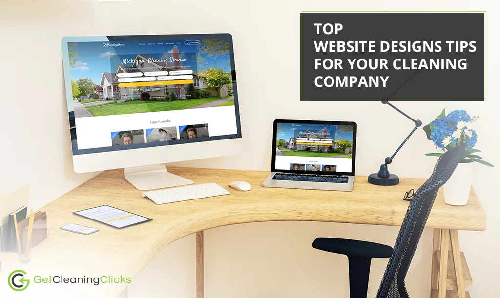
Having a website is much more than just doing whatever your competitors are doing. Saying that “I want a website because all of the successful businesses have one” shows a lack of vision. Your website is like a store open 24/7; it has to be designed to make the buying process intuitive and easy.
For all of you who have commercial and residential cleaning websites, there are best practices that you can follow. Today you’ll find many cleaning services website examples, and if you follow these tips yours could be one of the best.
Keep your website clean and simple
Keeping clean your cleaning business’ website seems pretty obvious, don’t you think? Well, this applies to every industry though, because nobody wants to navigate a disorganize site. We know there’s a lot of useful information, great service offerings, and cleaning bargains you want to show to your customers, yet it’s essential to not overfilled your home page with information and files. It’s more distracting than impressive, believe it.
Use a pricing calculator
Your website visitors expect some pricing transparency, so make sure you have a fully functional calculator for all of your cleaning services. The more accessible your prices are, the likely your visitors will reach out to you with a follow-up. The best thing you can do is to get an automated tool. Nowadays, there are many apps that could provide it to you, but if your prices are not so complicated to estimate, you can place them in a visible table on your page, instead.
Install a chatbot or messaging system
Probably your future customers are going to have a lot of questions about the specifics of your cleaning service. Provide them with a quick and easy messaging system, right there on your website. You have two options: install a chatbot that will create automated answers or open a messaging system that will connect you with a visitor with questions. The first option is based on an algorithm and if you have the means you should try it. Use the second option only if you have employees or time to answer messages.
Keep your loading time low
Without a doubt, this is the essential web design tip. If you don’t follow this, all the other points don’t matter. The majority of your visitors will get tired of waiting for your website to load and closed the tab. Two or three seconds is the limit. Be sure to make some tests on different devices and wifi connections. Our recommendation is you reduce your plugins and complements on your website to speed up your loading time.
Create strong CTA’s
This is a common mistake for many business owners. Even if your website is fully functional, loads fast, and is easy to navigate; not having strong Call To Actions will mean your visitors won’t know what to do next. Where can I book my cleaning service? How do I take that special deal? How to get in touch with an employee? These are some of the questions your visitors may be asking itself, make sure to put the answer where they can find them.
Too much technical jargon for you? Don’t worry, contact us and we help you develop your best website version. You’ll be booking new customers in no time!

